I hold a special place in my heart for all the projects and experiences gained thru my studies at Columbia College in Chicago. Creativity wasn't bound to real-world business objectives or budgets, which fostered a "safe" era of exploration. Courses included logo & identity, typography, illustration, and graphics design for various mediums — magazines, books, informational, web, packaging, product. Below are selected works from an archive that I frequently revisit for inspiration.
Undergraduate studies
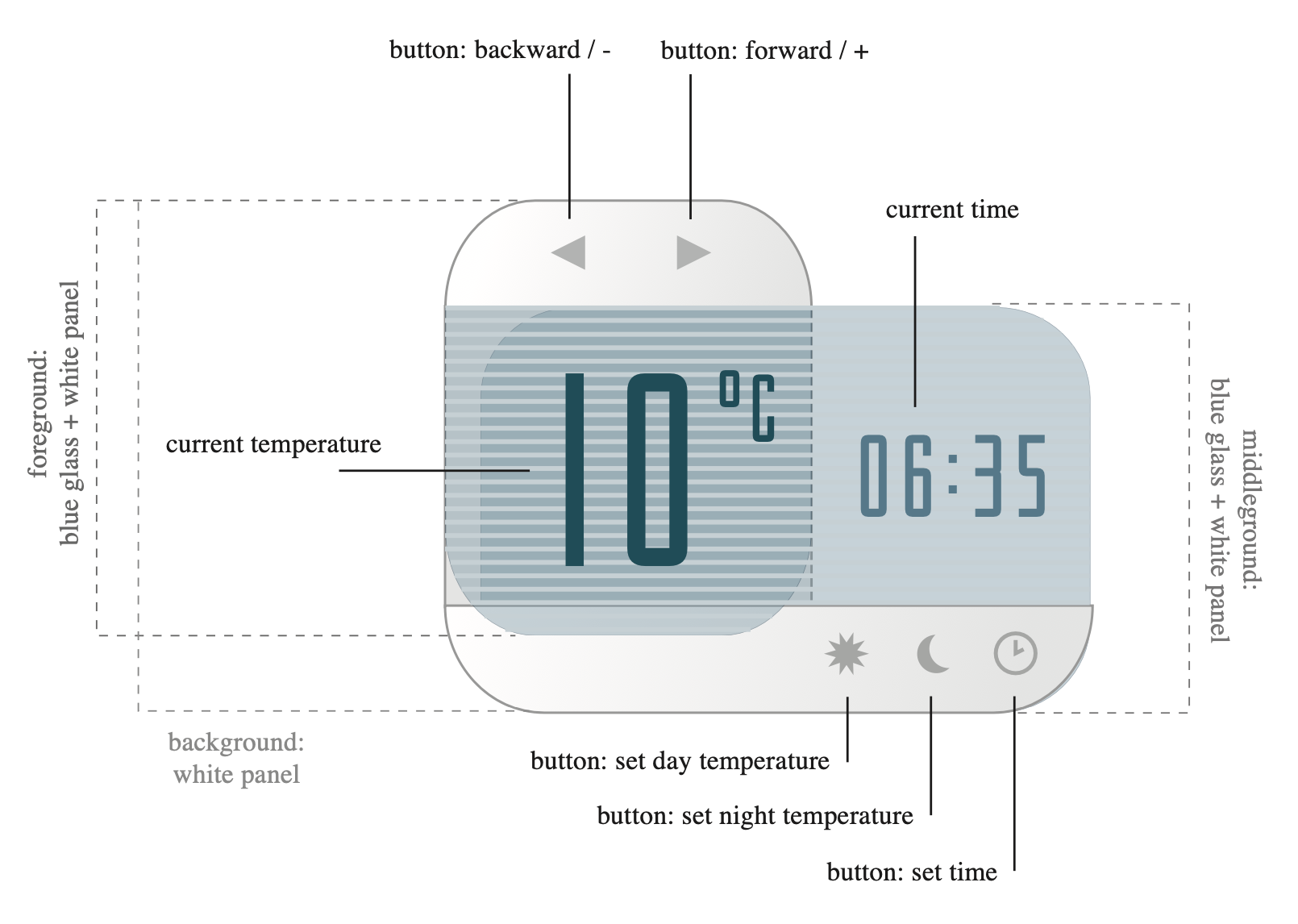
Thermostat usability study
During a 2006 study abroad in the Netherlands, I collaborated on my first ever usability study. My group chose a legacy model of a thermostat to test with other students to gather pain points and challenges. We summarized these research findings; created UX concepts of improvements; mapped each function; and concluded our project with user-validating one chosen concept. This project taught me the significant value of user research and "form follows function" — a principle that, upon retrospect, my design did not accomplish! Read the full report
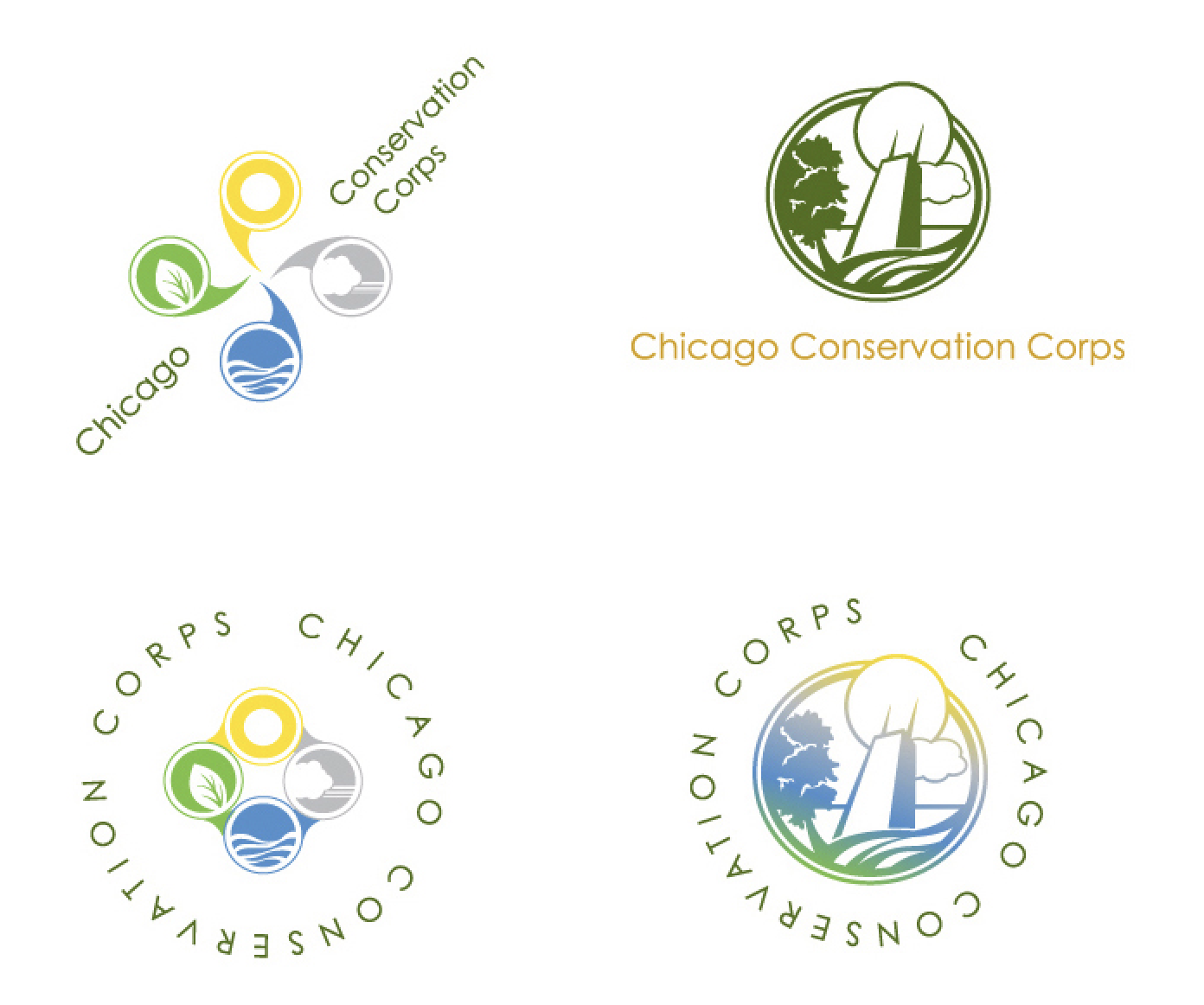
Chicago Conservation Corps (C3) logo design
C3 turned to our college to create their new logo identity. They had two requirements: convey the circular motion of "recycling", and include four elements of nature — fire, air, water, and earth. I contributed four concepts — one of which was purchased by C3.
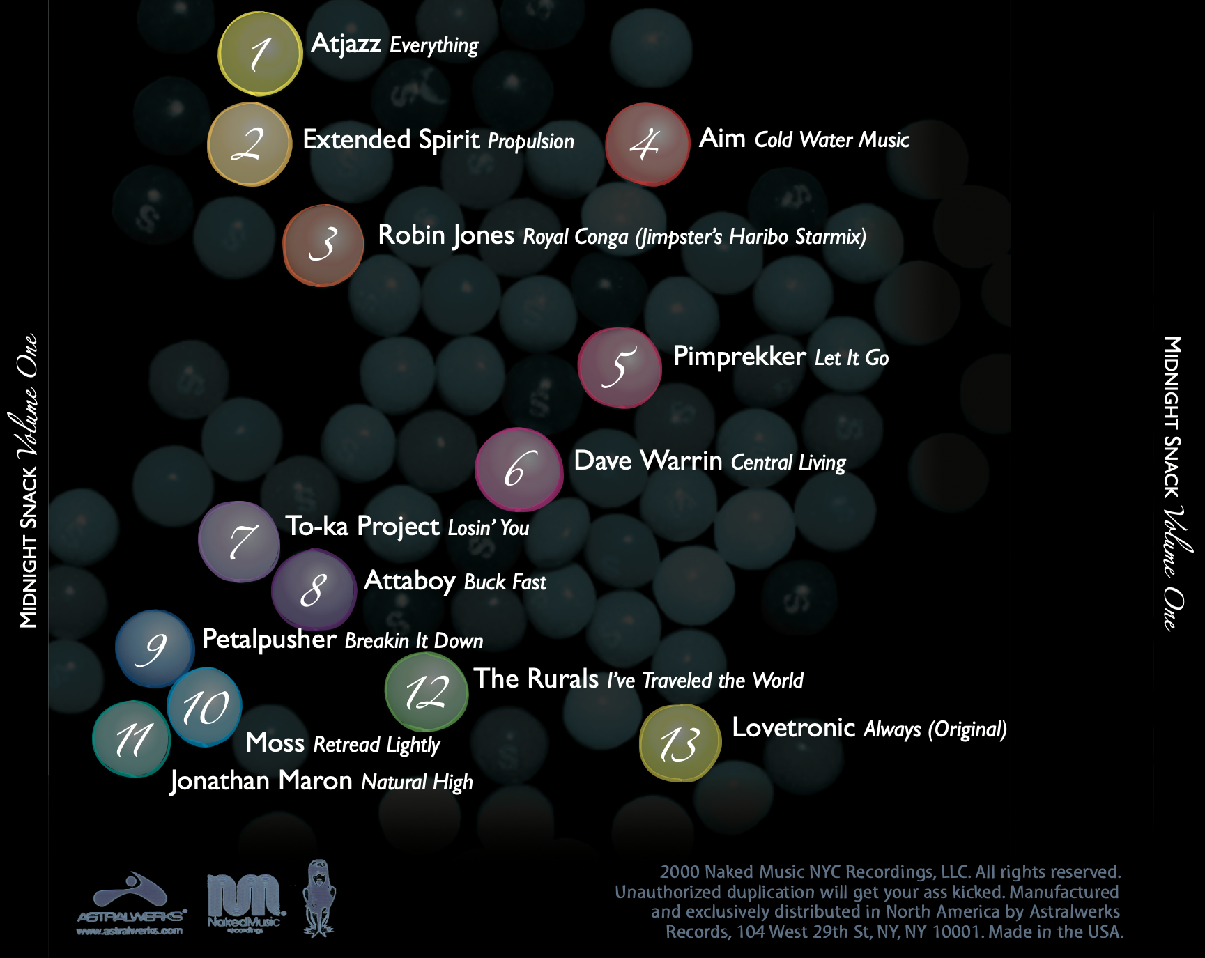
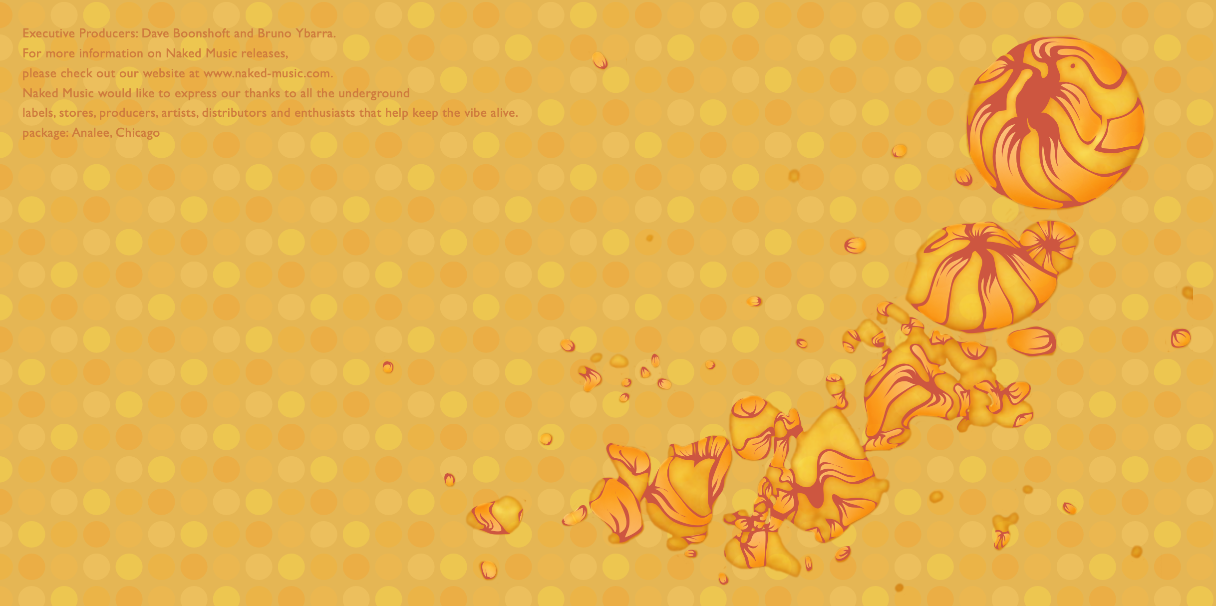
Midnight Snack album design
I drowned myself in various music genres while in college, usually playing in the background for hours as I completed design projects. (It's a habit I continue today.) My late-night discoveries led me to the dance record label Naked Music. For a class project, I designed the case inserts for one of their CD albums. My aesthetic involved digital photography that was manipulated in Photoshop. This output was finally overlayed with vector shapes and text in Illustrator.
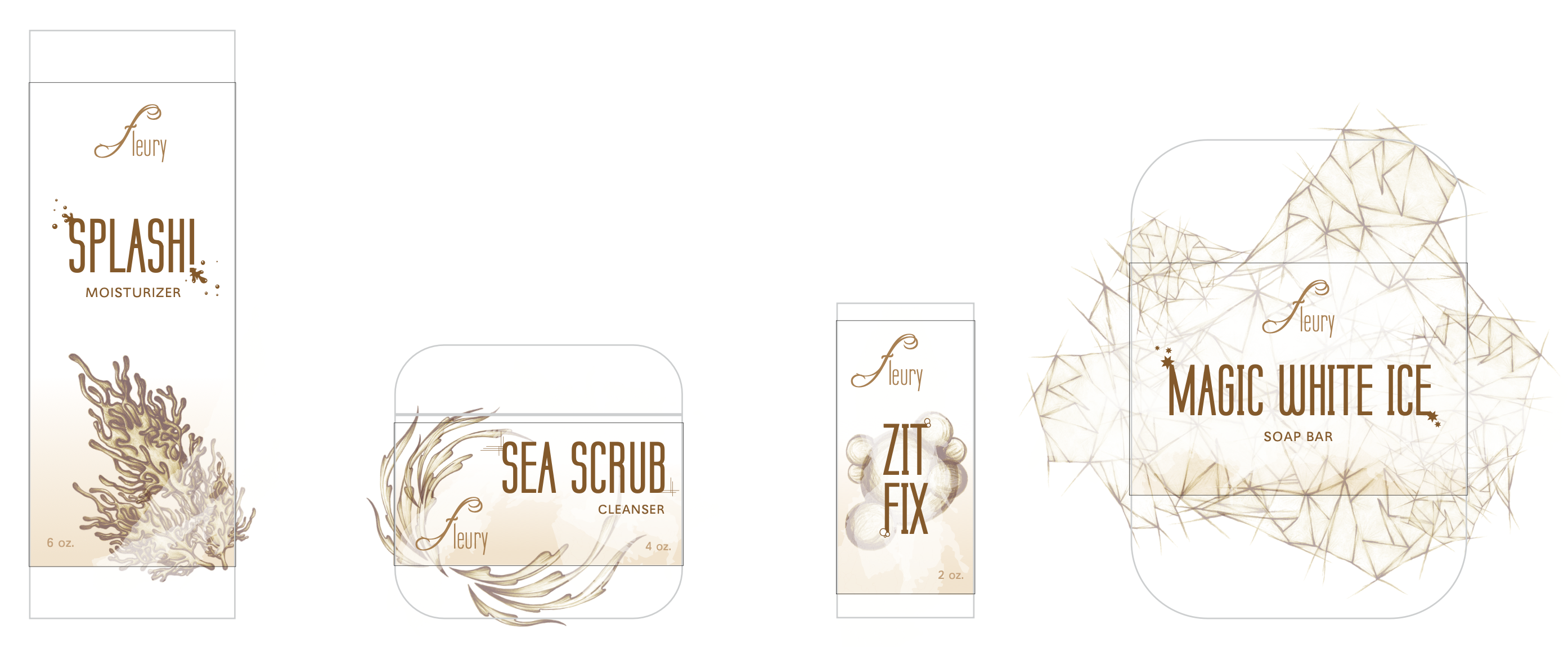
Fleury Spa & Salon package design with illustrations
I loved incorporating hand-drawn pencil illustrations wherever I could in my class projects. Shown in these flattened renderings of package designs are coral reefs, sea moss, bubbles and ice for an aquatic-themed fictional spa.
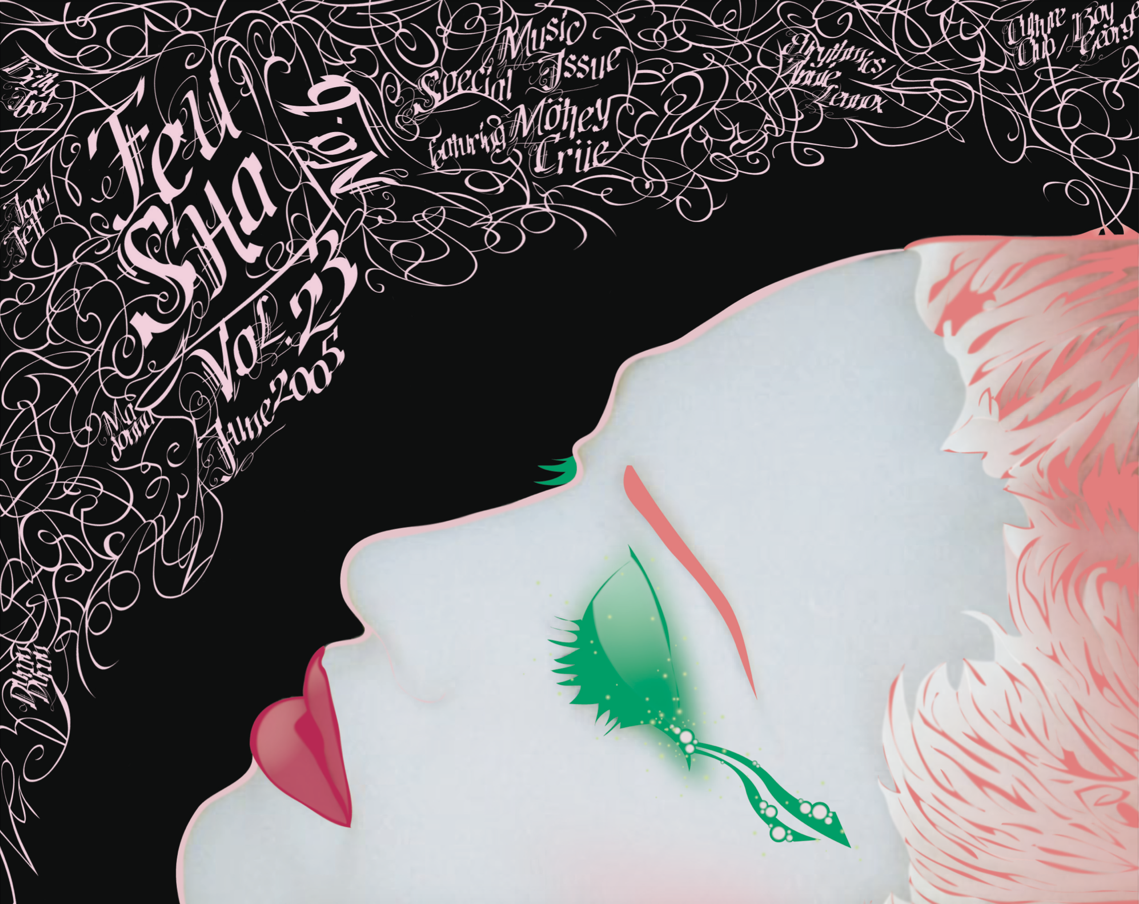
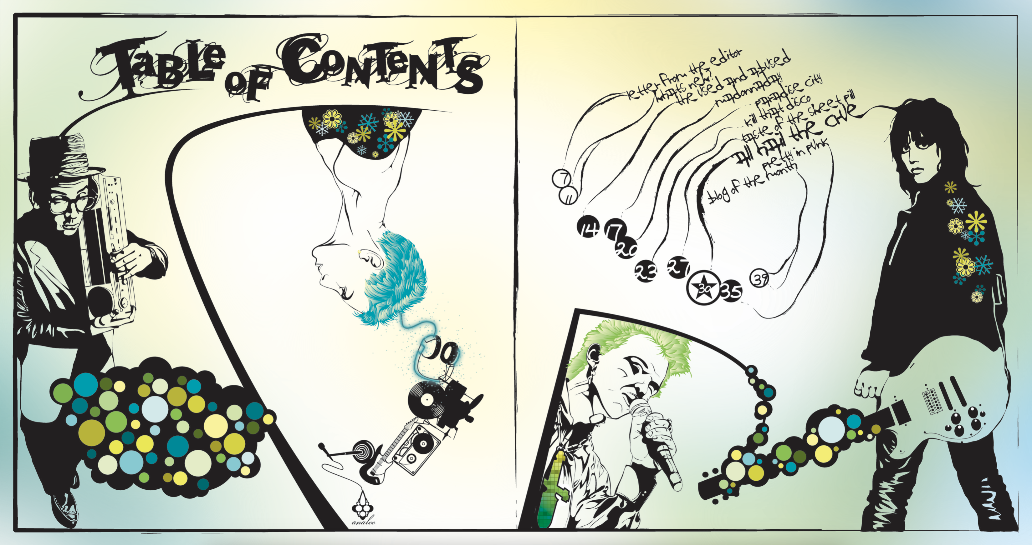
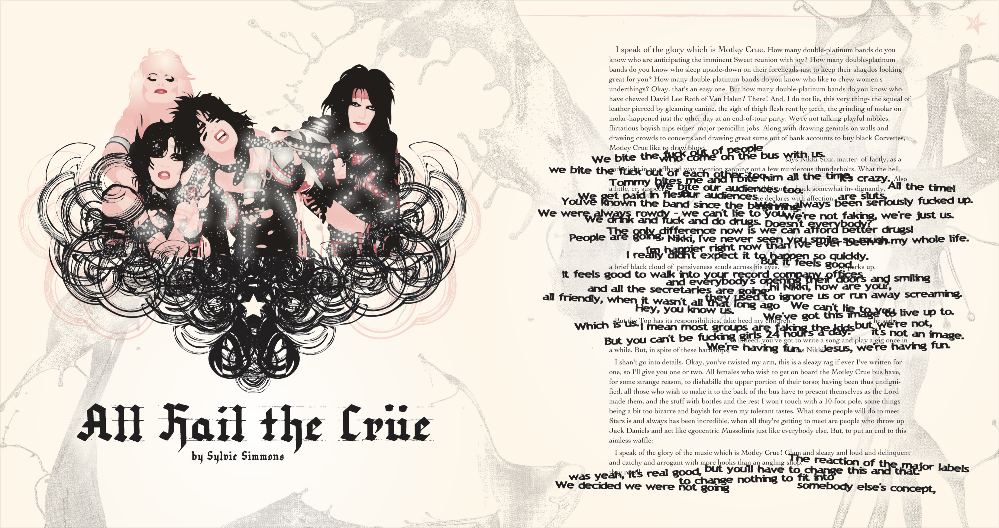
FeuSha Magazine spreads
FeuSha is a fictional magazine for 80's music icons. It was manifested during an experimental typography assignment. My favorite requirement of this project was to focus on a font's characteristics rather than legibility. For example, quotes in the feature spread are messily displayed to convey the brash rockstar answers from Mötley Crüe.
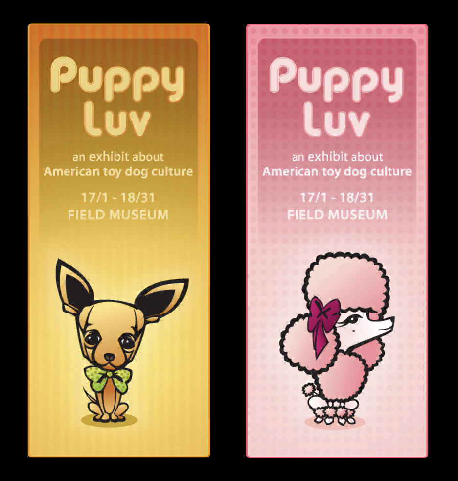
PuppyLuv exhibition posters
These poster designs demonstrate my interest in creating illustrative identities lined with thick black strokes and filled with light gradients and patterns. I still harbor this aesthetic — pairing "loud" and "soft" elements — into my current work.
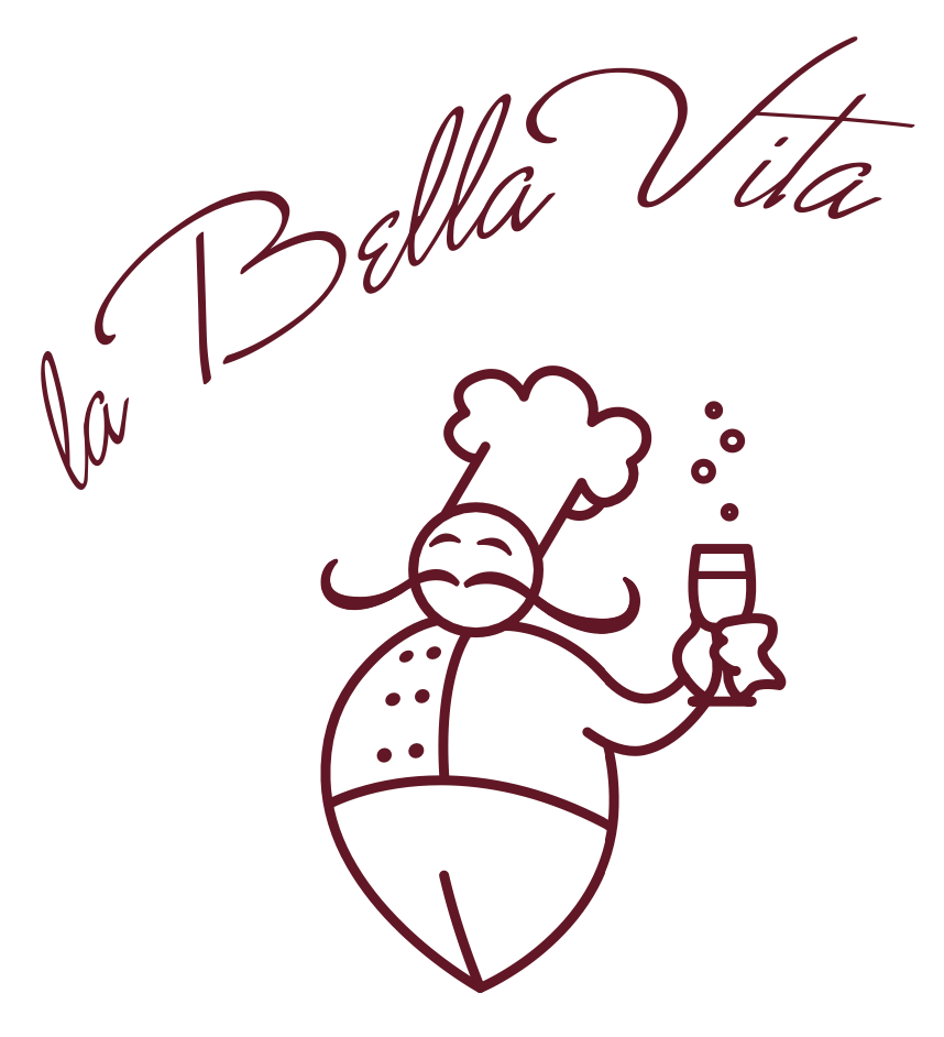
La Bella Vita logo design
This little guy was exactly how I imagined the identity for La Bella Vita, a fictional Italian restaurant. The use of circles and round edges conveys a joyful and content chef.